About Access discuss their terrain guides and how they can help accessibility in providing visitors with an overview of their surroundings
Increasingly in an age of instant media we find that improving accessibility is not just about making adjustments to achieve equality, it’s also important to let people know what you’re doing.
A shopping centre, visitor attraction or even a town or city centre is more likely to appeal to disabled visitors if it can offer the features which make it easier for them to navigate the area. It’s likely to attract even more if it can also show in advance how the land lies.
It’s the responsibility of venue operators to make it clear to people what they can expect if they are planning to visit, and the speed and detail offered by the internet and social media mean it has never been easier to do that.
Terrain guides
To help, in recent years we’ve developed terrain guides. Some places already have them, others would benefit. They are ideal for any outdoor attraction, and the principles are relevant to any sizeable public area.
Most town centres, city centres and shopping centres will have maps at strategic points, such as the pedestrian exit from a car park, to show visitors where they can find particular retail outlets, attractions and amenities. Department stores will usually indicate the location of lifts, escalators and the restaurant.
Terrain guides take that further, and they are particularly useful for outdoor attractions such as stately homes, country estates and theme parks, where nature presents its own obstacles and necessitates the use of different styles of development and construction materials.
The nature of terrain
Typically, you would expand the information presented in a standard map of a property and, in addition to pointing the way to the loos, gift shop, picnic area and sites of particular interest, you would advise people on the nature of the terrain.
It’s helpful to indicate whether the site, or a particular route round it, is suitable for particular age groups such as toddlers in prams and buggies, or older and disabled people with mobility aids such as sticks or wheelchairs.
Is it level? Are there steps or other potential obstacles? Is there a queue assist service? How long does it take to get around – for disabled people and non-disabled people? Test it to find out, because it’s easy to make assumptions about the mobility of visitors, and even easier to get them wrong.
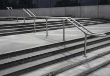
You can indicate where there are ramps as an alternative to steps, where the foopath has a slope and how steep it is.
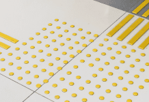
All visitors can benefit from knowing the location of any open water, and wheelchair-users will appreciate being given information on the nature of the various surfaces around the site – gravel, woodchip and even grass can make movement difficult.
More than just a map
The standard, two-dimensional map can include symbols and diagrams. Photography is easy to add and can make a big difference in helping visitors to find their way around.
The detail can be presented in guide books and pamphlets for visitors to use during their visit, but to really make an impact it should also be displayed online. Many people will rely on the website for help when they are considering whether a site is suitable for them and their companions, and this gives you an opportunity to add video clips.
You can also use the web version to keep people up to date on any changes to the terrain. If you carry out improvements and add new attractions you can post the details online and promote them through social media straight away instead of waiting weeks or months for the next print run. It’s ideal for advising people immediately if there is any refurbishment work at the site or any other factors which have changed the layout temporarily.
A terrain guide helps to inform visitors and increase their enjoyment of the experience, and it should sit alongside your access statement. We advise on what sort of information should be included, and we can work with an attraction’s marketing team to highlight the features that people need to know about.
As ever this is best done at the design stage – plan everything into the layout of the diagrams at the earliest opportunity because if you try to add things afterwards some essential information and diagrams can end up being squeezed to fit everything in!
More from About Access can be read on their stakeholder page.


