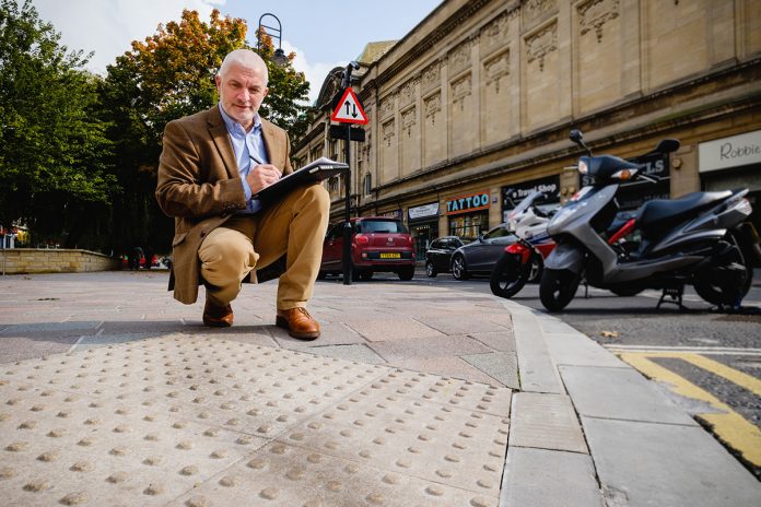
A well-designed wayfinding system can save time and reduce costs
“Ground floor: perfumery, stationery and leather goods…”. It feels older than 1972 but nearly 40 years on, the theme tune from the BBC comedy classic Are You Being Served? is an excellent example of what can be done to improve accessibility.
Most big stores display lists of the locations of their various departments next to lifts and escalators on signs which are easy to read, provided you’re not blind or visually impaired.
Grace Brothers were ahead of the game with their lift girl commentary – audio assistance is acknowledged as best practice by authorities including BS 8300 and the NHS Wayfinding guide.
The latter itself predates the Equality Act 2010 but sets out some principles that remain valid today, whether your premises are a small surgery or a sprawling hospital; a state-of-the-art shopping centre or a suite of offices.
NHS Wayfinding guide
The NHS guide is informed by research and responses about what works and what doesn’t.
Among the observations was confusion about poor signage to point people to an entrance that wasn’t at the front of the building, maps that don’t show all the buildings, signs that don’t include all the destinations, and signage that is too cluttered and lacks impact.
The document adds that “getting lost is so much a part of life that solving wayfinding problems is often given a low priority, ignored or dismissed as an unalterable and unavoidable aspect of the site’s design”.
In common with BS 8300, the guide promotes the principle that wayfinding information should be accessible to at least two senses.
Sight is the most versatile, enabling people to identify things that may lead to their destination and to spot people who might be able to provide information. Touch features, such as changes to the floor surface, are helpful to people who have a visual impairment.
Smell is not often included in a wayfinding strategy but it can play a significant part in helping people along a journey which includes smells of food and coffee.
Sound can go beyond the information displayed in a lift about floor numbers. In other scenarios, it’s also worth thinking about screening out irrelevant sounds.
The NHS highlights the need to demonstrate accessibility awareness before a visit, starting with appointment letters, which in another environment might be relevant to a job interview or business meeting, site map and spoken or written directions.
You then need accessible information to help people get to the premises, including road signs and site entrance signs, with more signage and maps to help people get around the site.
Finally, you should present information that lets people know they have reached their destination – and it helps people join the dots if significant features have been mentioned in the previous information and retain the terminology that people will have become familiar with in arranging their visit.
But signage alone is insufficient and you should also think about the context, for example poor lighting will impact on people who have a visual impairment and can create difficulties for someone with a hearing impairment by restricting their ability to lipread.
Maps are handy provided they are accurate and well laid out, whether they are purely visual or have a tactile element, but the benefit of fixed displays is limited. Portable maps can address this problem to a degree, especially if, on a larger site, they include landmarks such as fountains and statues, which are excellent reference points for people trying to find their way around.
Within a building the use of different colours for different floors can help people make their way to their destination and tactile features can also play a part, which goes beyond braille and embossed signage.
Options include blister and corduroy paving as well as other deliberate changes in floor surface, from wood to carpet or concrete to flagstones. It helps people to detect that they are moving to a different part of the site, enabling them to work out where they are on their journey. Tapping rails at the side of a footpath are helpful for those who use a cane, but they mustn’t present a trip hazard.
Successful wayfinding
The success of any wayfinding system is judged by how easily a person gets to their destination and knows they have arrived, and that in turn can enable you to measure the costs against the benefits.
The direct costs may include developing or refining the wayfinding system, designing the wayfinding signs, maps, leaflets and letters and communicating changes to people.
But the result – a well thought-out and well-designed wayfinding system – can reduce costs in the long term because staff will spend less time giving directions, appointments are less likely to be delayed and are more likely to progress smoothly because the participants have enjoyed a hassle-free route to their destination.
Ian Streets
Director
About Access Ltd
Tel: +44 (0) 1482 651101
Please note: this is a commercial profile.


