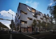
Cutting-edge, attractive and even well-intentioned design can make new buildings difficult to navigate for people with disabilities. Ian Streets of About Access examines some common issues
They may look fantastic but although modern offices certainly dress to impress, they often include an array of eye-catching features which can cause any number of difficulties for disabled people.
Some of them are practical problems, with basic but essential equipment positioned just awkwardly enough to be out of reach.
Others are striking designs and décor which may even have been installed with the good intention of helping disabled people to find their way around but which actually just cause confusion.
Older properties may be protected as listed buildings, making it impossible to widen doorways, install accessible WCs, replace steps with ramps and carry out whatever else needs to be done.
Local authority offices, libraries and other official properties dating back to the 60s, 70s and 80s are all likely to require significant modification to achieve the required accessibility standards, but there is no guarantee that anything built during the last 30 years will hit the mark either.
The key to accessibility lies with the attitude and awareness of the people who designed and built it. That gets historic monuments off the hook but there is a case to be made that the post-war progression towards more sophisticated architecture should have been accompanied by a recognition that disabled people needed to get into and around the striking new buildings that were springing up.
The old Disability Discrimination Act came about in 1995 as a result of a public campaign, and if the public was aware then architects and designers should have at least had an inkling!
Any architect or designer should set out on a new project with the aim that it can be used by as many people as possible. They should examine every feature and ask whether its design puts disabled people at a disadvantage, and what can be done about it. There are countless examples of good practice to learn from and, sadly, too many opportunities to learn from the mistakes of others.
What they won’t find when it comes to designing a brand new, state-of-the-art office complex, shopping centre, transport interchange or whatever is a good reason for getting it wrong. Whatever the accessibility issue, the chances are someone has seen it before and overcome it. In this day and age, architects and designers should also routinely be equipped with foresight – the needs of disabled people are nothing new anymore and can be anticipated easily.
So what are the examples we’ve found of poor practice in nice, new, shiny buildings?
Manifestation on glass walls and doors is a frequent offender. Not necessarily in the sense of designers ditching manifestation altogether and creating the hazard of clear glass, but where they have embarked on manifestation overload, with more pattern than plain glass and next to no chance of identifying where the door is!
We found another example where the designer so was determined to create a look of continuous glass that instead of placing the lock at a height where most people could reach it, they put it on the floor.
Inside that office we found that consideration had been given to disabled visitors by installing sockets at low levels, but the convenience came undone when someone put a desk, chair and drawers in the way.
Shiny, highly polished floors pick up so many reflections and can appear to some people like a hole in the ground. Carpets can also cause confusion. A lecture theatre we visited had a wall-to-wall gaudy design in beige, brown and orange and was particularly hazardous by making it difficult to see the steps.
These are general issues about tonal contrast and it’s important from the start to ensure that fittings and furniture are clearly visible. If you have a clear glass table, even leaving magazines or other objects on there will help people see it.
The designer’s responsibility starts outside the building because disabled people need to be able to arrive safely. Sunken water features and gardens can present a problem and, increasingly, these are finding their way into interior design as well.
The main entrance needs to be accessible. Signage needs to be visible and helpful, set at the right height and conveying a clear message that won’t be misunderstood. Let people know when they have arrived at the place they are looking for and help them find their way around. Reception desks should offer different height options.
With lifts, some emergency communications systems have a telephone but it is much easier to fit a push-button intercom that can be activated with an elbow or a clenched fist.
And we’re not just talking about new build. As trends change and modern designs emerge, it becomes cheaper and easier to carry out fit-outs and it could be easy to overlook the needs of everybody who will use a building.
Please note: this is a commercial profile
Ian Streets
About Access
63 Wilson Street
Anlaby
Hull
HU10 7AJ
Tel: 01482 651101
Tel: 07957 564182


![[VIDEO] Making DorTrak reports easy to read with Fireco Inspecting fire doors at Fireco, firedoor technology, 2023](https://www.pbctoday.co.uk/news/wp-content/uploads/2024/04/JPZ_2364-web-218x150.jpg)
![[VIDEO] Re-flow Field Management review by Traffic Management Installations When TMI began subcontracting for councils and government bodies, they wanted to present their site reporting in a more professional manner](https://www.pbctoday.co.uk/news/wp-content/uploads/2025/03/TMI-Media-1-218x150.png)


