Accessibility requirements aren’t just about the here and now – at its best, it involves building in provisions for the future, so if something changes significantly, any challenges which result can be met seamlessly
In the public sector, that scenario is addressed by the anticipatory approach required by the public sector equality duty, which means that in planning a project, an organisation must demonstrate that they have considered all the protected characteristics under the Equality Act 2010 and the effect the proposed policy will have on them to meet accessibility requirements.
That obligation doesn’t apply in the private sector but the principles behind it are worth adopting anyway because they will help to create an inclusive environment and reduce the risk of being caught unawares.
One of our clients is in the process of making changes to parts of its estate so it can meet the needs of a recent recruit who is blind.
Features need to be scoped and planned effectively
The reasonable adjustments required are limited to the areas of the building which are routinely used by the individual concerned, so fairly modest and inexpensive. But they still need to be scoped and planned effectively, and the project will hopefully provide a template for dealing swiftly with any similar instances in the future.
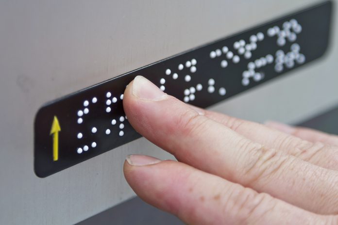
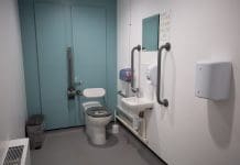
The property has such general features as ramps and accessible loos but the problem, in this case, arose with the doors – there was no braille or tactile signage the new arrival could read which would tell them whether or not they had arrived at the office they were trying to locate.
Because of the nature of the business and its work, the lack of signage isn’t an issue for visitors, who are always accompanied by staff for security reasons. But employees should be able to move around the building independently, and that’s why we were called in to help.
Having identified the individual’s access requirements we made some suggestions, one of which was that stick-on braille signage should be provided to indicate the number of rooms used by that person. It’s not an optional extra, it’s something the individual needs and it would be seen as a reasonable adjustment for their employers to make under the provisions of the Equality Act.
It is imperative that there is consistency in the design and placement of accessibility requirements
For this to work properly it is imperative that there’s consistency in the design and placement of the signage. The guidance tells us the sign should go on the wall on the latch side of the door – not on the door itself because it would be difficult to interpret whenever the door opened and closed.
If the same issue crops up with another employee then you would apply the same approach in their area of the building, and when the opportunity arises you would make changes to the other rooms, but it’s a big site so that would be a gradual process.
Start with the rooms that are essential and bear in mind that the best solutions are often the simplest. If you use tactile numbers from the outset they can be understood by people who don’t read braille.
Further issues emerged though as we then started to look at the general signage around the building, the design issues of the property itself and some of the features within another building nearby.
The second building presented the challenge of a very complicated room numbering system which comprised the initials of the street that it’s on, letters to indicate the location of the cores of lifts, a number for the floor and then another one for the actual room. It was less a navigational aid than a secret code!
It’s not the job of the door numbers to tell people which building they are in or which floor they are on. The general wayfinding signage should do that, which is why we have audio messages in lifts and – hopefully – big numbers on the wall outside the lift doors and in general circulation areas.
It’s also good for these areas to display signage which indicates the location of the loos and the room numbers in each direction, such as rooms 1-10 to the left and 11-20 to the right.
One of the fails we found was the signage indicating the accessible loos were in the basement. Unfortunately, it was placed next to some lifts which didn’t actually go any lower than the ground floor.
Once you found a lift that did serve the basement and you made your way there, you found there was no sign to tell you where the accessible loos were!
Modern technology is aiding in accessibility
Modern technology offers some brilliant solutions for this sort of thing. You can use beacons linked to apps – they emit a signal that a smartphone can pick up and guide you where you want to go. They will also play the route back to you next time you need it.
But the experience of the individual, in this case, underlines the importance of having good signage in a building and of taking an anticipatory approach.
You might not have any disabled people in your workforce today but that could change in the future for a variety of reasons. And you might never know whether a customer or other visitor has an impairment until they arrive, so it’s in your interest to ensure your premises are accessible.


