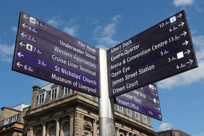
Ian Streets, managing director of About Access, explores the priorities of signposting and wayfinding
In an age when even some car sat navs are being rendered obsolete by smart phones it’s perhaps appropriate to pause for thought on the priorities of signposting and wayfinding.
Different people will have their own preferences when it comes to the various methods of communication, and key factors in that are circumstances and location, but they all have the same ultimate desire – to complete a speedy and trouble-free journey to their destination.
That’s the same whether you’re travelling by car, rail or bus to a major complex – say a hospital or university campus – or you’ve already arrived and face the task of finding a particular building.
Focusing on site-specific location information
The operators of the premises have a responsibility to guide you every step of the way, and in doing that they should consider the needs of everybody, wherever they are travelling from and taking into account the possible impact of any physical impairment.
An electronic device, provided it is up to date, should do the trick for most people who are driving to an appointment, but managers of a campus need to focus on site-specific information such as location of car parks, availability of accessible parking bays and guidance to help people find accessible routes around the property.
Visitors arriving by bus or rail are likely to need information about connecting public transport options. How many different bus routes serve the campus? Which is the best service and stop for a particular department? A hospital site local to us has at least three bus stops within its grounds, and if a person who has limited mobility gets off at the wrong one they’ll find it difficult to reach their destination.
Nor should it be assumed that a taxi driver will know their way around a campus. By sending detailed and up to date information in advance you can remove all doubt and enable visitors to get dropped off in exactly the right place. In providing such guidance, ask if people would like to receive it in a particular format – not everybody has a mobile phone and knows how to use all of the features. And in planning the content think very carefully about routes, landmarks and accuracy.
Arriving at a site hopefully equipped with directions on a smartphone app and a printed map, the visitor can look forward to finding out whether the physical signage will complement, or trigger a communication breakdown!
The standard rules of signage
All the standard rules of signage apply – the location, height and angle of signs should all be considered. Fonts should be clear, not cluttered, colours should offer contrast, and materials should be selected carefully to avoid problems with reflection and glare.
People need to feel confident that they are heading in the right direction and they need to be informed clearly when they have reached their destination. It’s also helpful for landmarks along the route to be identified clearly, and maybe creatively.
Take a multi-sensory approach and highlight features which might lend themselves to easier detection by people who are visually impaired. Sounds and even smells can help people find their way around – turn left at the fountain and right at the coffee shop. But at the same time try to keep the instructions short, simple and relevant, and avoid presenting people with a long list of directions.
Think also about what happens when a person has finished their visit and is ready to leave. It’s unlikely they will be in the precise place where they arrived. Do they need to get back to that point? Is there a quicker route to their car, pick-up point or bus stop? Is that route accessible?
Communicating changes effectively
Given the size and sprawling nature of some sites it’s a good idea to conduct regular reviews of routes and of the information provided to guide people around them. If your workplace is in one area of a site you’re not necessarily going to know if a development in another area has forced the closure, even temporarily, of a footpath. Or, to take a more positive view, if it has provided an opportunity to replace some steps with an accessible ramp which has created a new, more convenient route for people with mobility problems.
In reviewing the routes try to identify where and how they can be made more accessible. Are postcodes adequate for directing people to their destination? Is What 3 Words a better option?
And if changes are made ensure they are co-ordinated, presented as a package and communicated across all platforms as effectively as possible. However slick the tech and however instant the connection the fact remains that content is king, so make sure it’s consistent.


![[VIDEO] UK-based firm reveals ‘world’s first’ fully AI-driven architectural project Studio Tim Fu has revealed the 'world's first' fully AI-driven architectural project in Slovenia, developing six luxury villas on the Lake Bled Estate](https://www.pbctoday.co.uk/news/wp-content/uploads/2025/03/Interior-1-studio-tim-fu-218x150.gif)


