About Access discuss how simple design faults can lean to difficulties in accessibility, providing tips to resolve the issues at the start of the process
Design faults can be common. Whether it’s an urge to come up with a fancy design, a rush to get a job completed or just simple ignorance of people’s needs, we’re seeing too many examples of accessibility being overlooked.
Some people will always prefer form over function, style over substance, and you can get away with that sometimes, but not when it comes to making the built environment accessible to as many people as possible.
We’ve decided to highlight three common design faults which occur all too readily in new-build and in renovations. Our list is not exhaustive, it’s examples.
Handrail design faults
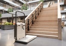
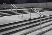
Frequently we have seen designs and completed projects where handrail design doesn’t meet the requirements of Approved Document M of the Building Regulations.
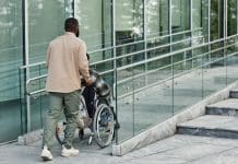
It matters because handrails are helpful to a lot of people when they are negotiating changes in level, whether by steps or a ramp. They can make things easier for disabled people, elderly people and anyone carrying something awkward or heavy who might need to hold a handrail with their free hand.
We’ve seen flights of steps where the handrail is only provided on one side, overlooking the fact that some users for various reasons will only be able to grip a handrail with a particular hand. If the handrail is on the opposite side to their free hand, they will face difficulties.
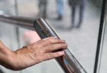
Designers should also note that some types of support brackets can get in the way when someone is sliding their hand along a handrail rail. Some designs force people to take their hand off the rail, loosen their grip or risk hurting their hand. These options are not ideal.
The end of the handrail needs to extend horizontally at the beginning and end of the steps and should be designed in a manner which will prevent it from getting caught in loose clothing, such as sleeves on jackets and coats. By extending the handrail you also provide a clue for blind or partially-sighted people that there is a change of level going up or down, or that they have come to the end of a flight of steps. In addition, you enable people to take support from the handrail before or after they start using the steps or ramp.
Design faults with wash basins and WCs
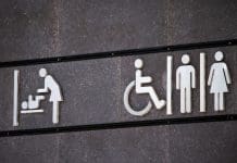
Design faults are also surprisingly common when it comes to wash basins in accessible WCs.
The key point to remember is that it is imperative for reasons of hygiene that a person can reach the wash basin and wash and dry their hands while still seated on the WC.
Is the basin close enough? Frequently it’s not, it’s out of reach. Where is the tap? Often, it’s located at the furthest point of the wash basin from the WC pan, putting it out of reach.
Assuming you get this positioned correctly and the person can get their hands wet, can they reach the soap dispenser? If they can, more often than not they won’t be able to dry their hands because the hot air blower is at the far side and out of reach.
Some people may need to wash other body parts and can’t use a hot air drier so paper towels are essential and should be within reach of the WC pan.
Many of the questions should be obvious, and the approach to resolving them is also straightforward. To model it, just sit down on a WC, think about the facilities that you need next and look at whether they are close enough for you to reach without standing up or risking falling over!
Issues at reception desks
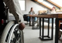
Reception desks are another feature which frequently cause problems. Having the correct height for reception desks matters to all users, not just people of short stature or those sitting in a wheelchair. Also, someone who is tall and has a bad back might struggle to bend, so it is important to provide counters which are suitable for all.
There are generally two suitable heights, one for standing users and a lower one for people of short stature or who use a wheelchair, and good practice will see these incorporated into a single unit.
You need to think about what the reception desk is being used for. Is it meet and greet? Do people need to sign in, read documents or make transactions? You need to take those points into account for all users – visitors and staff.
We visited a building recently which had been there for 30 years. They had refurbished the reception area and added a lower counter at one end, but none of the staff sat there. They were at the other end hiding behind computer screens, out of sight of many of the visitors. Reception desks should not be designed to make it easy for staff to hide behind and have a chinwag while visitors look around for assistance.
If you need help improving the accessibility of your organization or to do more by improving your skills then please get in touch and check out our website
www.aboutaccess.co.uk


