In this article, Vectorworks explores how you can capitalise on Vectorworks’ Viewports feature to ramp up your everyday architectural drawings to be full of visual appeal
Vectorworks is renowned for its exceptional graphics capabilities. With its powerful tools, you can effortlessly transform the look of your drawings to truly impress clients and collaborators.
The power of Viewports for architectural drawings
Viewports are an essential part of the drawing creation process. They offer a wide range of options that enable you to enhance and customize your drawings.

Let’s explore four of the major aspects of viewports that you need to understand to reach Vectorworks’ full graphic potential.
Afterwards, we’ll jump into how to apply this knowledge to drawings during the architectural design phases.
1. Class overrides & data visualisation
Firstly, class overrides allow you to easily modify line attributes, hatches, fills, and more.
This means that you can effortlessly change the appearance of specific elements within your drawing, creating a visually dynamic composition that suits your exact preferences.
You can also apply data visualizations to viewports to visually represent important information for collaborators and clients.
2. Foreground & background rendering
Foreground and background rendering is another fantastic option available in viewports. By applying different rendering styles, you can create stunning overlays that add depth and visual interest to your drawings.
Whether you want to convey a sense of realism or experiment with artistic effects, foreground and background rendering gives you that freedom.
3. Sketch styles
Viewports provide the opportunity to apply sketch styles to your drawings. This feature enables you to add a touch of creativity and artistry to your work, making it appear more conceptual or even hand drawn.
It’s a fantastic way to inject personality into your designs and create a unique aesthetic that sets your drawings apart.
4. Stacking viewports
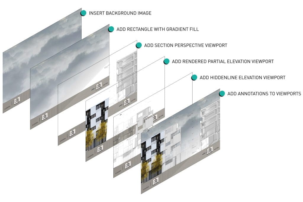
You can take your creativity to the next level by staking viewports and mixing the various techniques above to create breathtaking presentations.
By combining multiple viewports, you can compose images that showcase different perspectives of your design. Whether it’s plans, sections, elevations, or even axonometric views, stacking viewports allows you to present your drawings in a visually stunning and comprehensive manner.
Effective ways to add visual flair to your drawings, by project phase
Conceptual and schematic drawings
To start, let’s dive into the conceptual and schematic stage of drawings.
By applying a sketch style in the viewport settings, you can create a more artistic and expressive representation.
Using class overrides allows us to achieve a unique poché style for wall fills. This technique not only adds depth to the drawing but also creates a visually striking effect.
Design development & construction documentation drawings
Moving on to the design development and construction documentation plans, it’s crucial to showcase the wall components accurately.
By adjusting the class visibilities and setting up viewport settings properly, you can get a nearly perfect building section just from your BIM model.
Data visualisation can add clarity to your drawings. For example, when creating demolition plans, you can define graphic attributes of Existing, Demolished, and New items on a drawing.
Another example is using graphic attributes to show hatches on a floor slab, which can be used to create finish plans that represent accurate floor patterns using the specified materials.
Presentation drawings
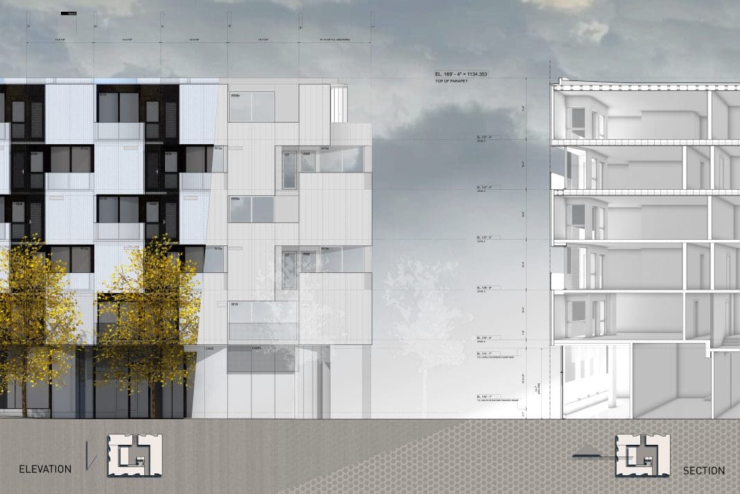
To create unique presentation drawings, take advantage of stacked viewports.
This technique involves having one viewport rendered to showcase the intricate details of the design, while another viewport with the poché style is placed on top.
Additionally, by carefully adjusting the transparency of the poché layer, we can strike a balance between showcasing the underlying details and adding a hint of mystery and intrigue to the drawing.
By adding drop shadows strategically, you can introduce a sense of depth and dimension to the drawing, making it visually captivating and engaging.
If you’re looking to explore architectural drawing and rendering techniques to enhance your drawings, the webinar linked has you covered.


